Category: UX/UI Design • Catagory: Concept Design
Following a previous project on the Trendland application in 2013, I've played around with some new mobile layout concepts.
The Vision
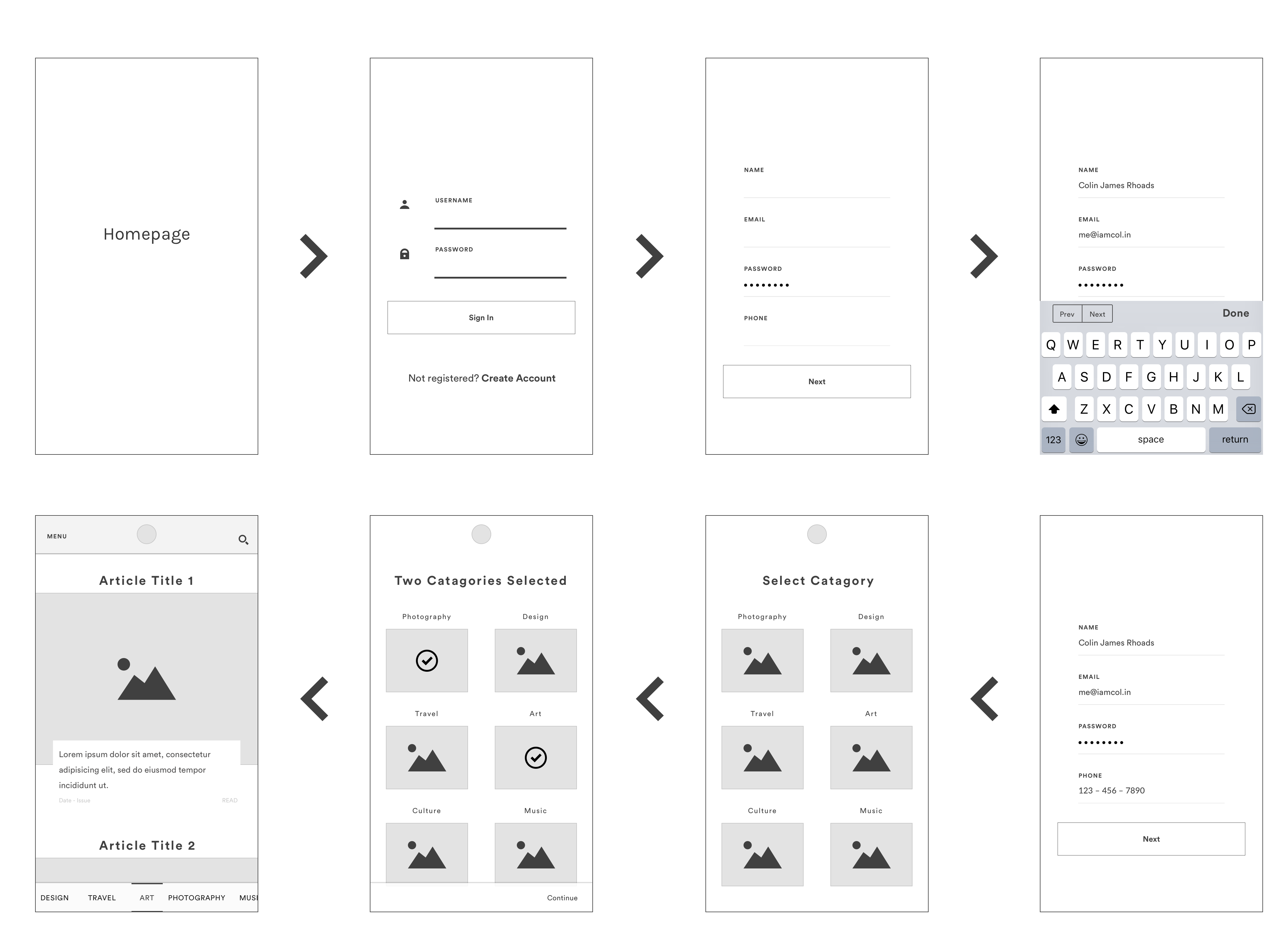
More than ever, users expect content to be customized for them. In this journey I've showed the user registering to the plateform, selecting genre's they like and flagging content they love.
Sketching the Idea
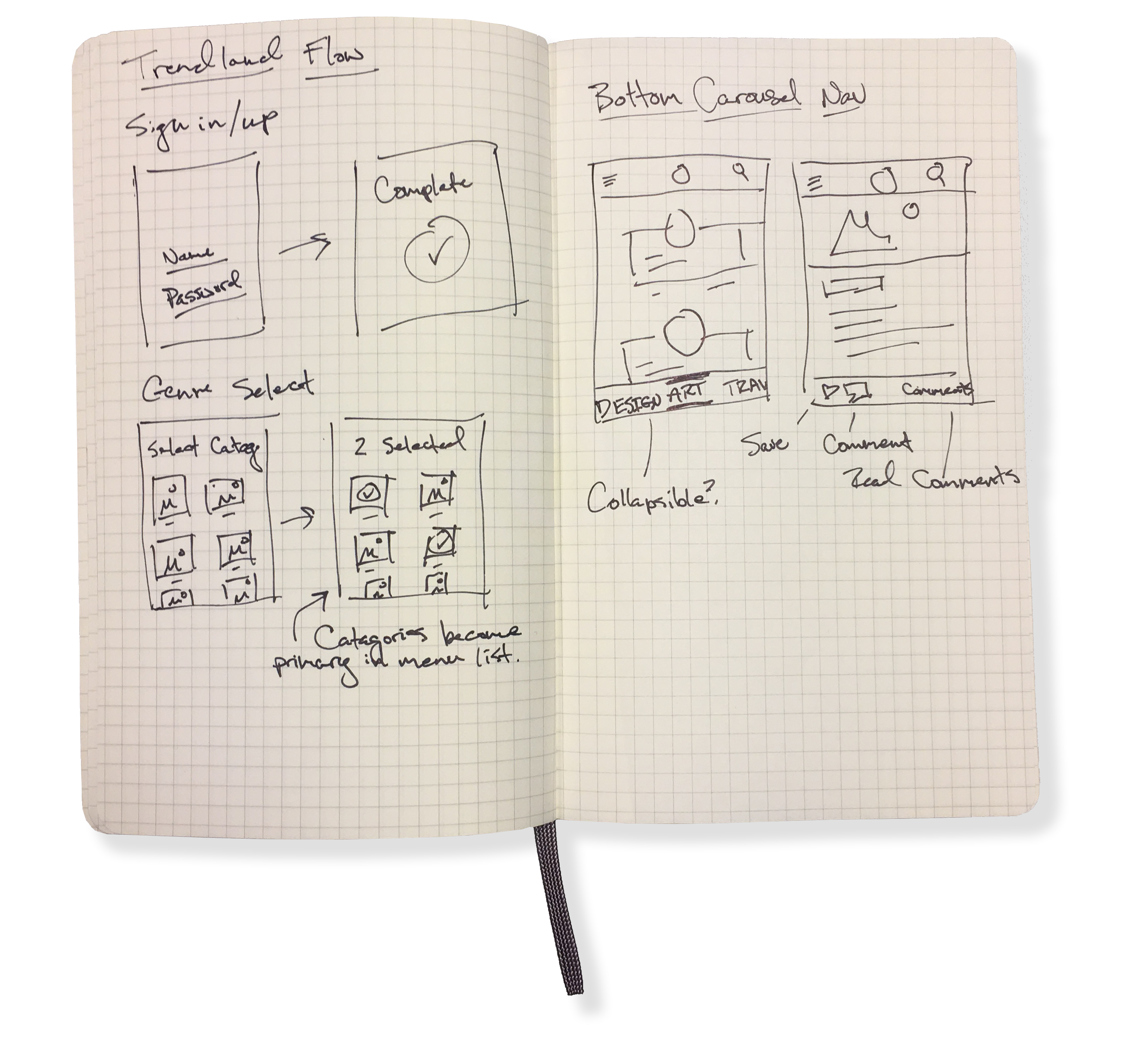
With an initial vision around the the general skematics of the application. I wanted to flush out on paper core functions which would be updated within the product.
The first one being the category select - how and where would the user select the content categories they were most interested in?
Second being the category navigation - what was easiest for a user to navigate through these categories within a mobile environment?
Initial thoughts were sketched out to the right.
WIREFRAMING
SIGN-IN
PROTOTYPES
Bottom Navigation
This concept evolves around the expanding research on one thumb user behaviors when using their phones. Reach charts show that this bottom bar area falls within the sweet spot of a users interactive reach within most smartphone screens. I wanted to keept the focus of this tab bar around top-level destinations for the applications, which is to allow the user to quickly swipe through content by genre. Having a scrollable tab communicates the current location effectively and mitigates any confusion around what content the user is looking at by always having the active catagory centered within the scrolling tab.
Footer actions
Depending on the context of the screen, a footer action bar will display in place of the bottom tab navigation. In line with the earlier vision statement, this is where users are able to flag content they love and allow the system to provide further suggestive content moving forwards based on a simple look-a-like algorithm.
